
 update (December 18, 2015): According to an article in the Albany Times Union by Paul Nelson, “Casino sign plan to be submitted to city in ’16” (Dec. 13, 2015), a new design for the pylon sign will soon be unveiled:
As it stands now, the pylon sign is generally framed on two sides by a contiguous white vertical and horizontal band and does not feature any glass, as was previously discussed. It’s unclear if that white band will be lit.
 bait . . . switch

– above: [L] the Casino’s pylon “bait” rendering and [R] my amateurish but more accurate Switch mock-ups –
You’ve probably seen the Rush Street rendering of its proposed pylon sign shown on the Left above; it’s a 2-sided, rectangular monolith parallel to Erie Boulevard (note: the street indications were added by me, and not indicated by the Casino on their rendering). On the right is my crude mock-up of the actual approved pylon: “v-shaped” with a giant 611 sq. ft. LCD screen on each wing of the vee. Because Rush Street never submitted a sketch, much less a detailed rendering of the real design and its orientation toward Erie Boulevard and Nott and Front Streets, and neither your Schenectady Planning Commission nor its Staff ever asked for the highly important documentation as part of its Site Plan Review, my awkward mockups are all we have for now. The uncertainty has led me to construct this QQ Pylon Collage:

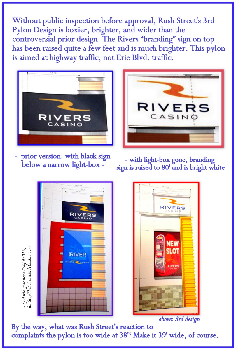 The surprise of a siamese-twin v-shaped pylon structure is, of course, in addition to the bait-and-switch elements we pointed out on Friday July 24 in a follow-up to our posting announcing the approval of the Casino Site Plan. The Planning Commission, without mentioning it, approved a version of the casino pylon that is
- boxier (no narrow light-box “lantern” at the top),
- brighter (a pure white background on the Rivers branding section of the pylon, instead of black, but with no Visual Impact Statement provided or demanded for any version),
- taller by perhaps 6 or 7 feet (having been raised to 80′ by removing the “lantern”), and
- wider (39′, instead of an already excessive width of 38′).
. . . than the versions shown to the public. Click on the collage to the Right of this paragraph for the details.
The following image sums up the various bait-n-switch elements:

In words, here are the basic bait and switch elements (there may be more as yet not revealed by Rush Street or their City Hall handmaidens):
 The Bait: A two-sided, monolith, rectangular pylon structure, 80 feet by 38 feet, with one giant LCD screen 19 feet by 32 feet, topped by a narrow “lantern/chimney” about 7 feet tall, which is sitting over a 14.5-foot tall Rivers Casino “branding” sign that has a black background, all shown positioned parallel to Erie Boulevard, at the intersection of Front St. and Nott St. (As explained in Comments to the Planning Commission and in several postings, the original design was far too tall and wide, and its monster digital LCD screen far too distracting and bright, for the location and for Schenectady in general. But, even worse, we have instead. . . )
 The Switch: First presented and approved at the July 22, 2015 Planning Commission site plan review special meeting: An 80′ by 39′ pylon façade, in an unexplained and never-depicted v-shape configuration, without a slimming “lantern” on top, and with its branding sign now having a much brighter white background and raised to the top of the 80′ structure, far more prominent in the sky. In addition, there will be a second 611 sq. ft. monster LCD screen, with one aimed at traffic reaching Nott Street and Erie Boulevard from the east, and one aimed at traffic coming up Erie Boulevard from the west.


each wing 35′ x 24′
What would a v-shaped pylon of the size contemplated by Rush Street look like, and “feel” like at that location? It is hard to know, given the failure of the Applicant to supply a rendering or sketch and of the Commission or its staff to demand this crucial piece of site plan documentation. Our search has found nothing similar in front of a casino on this planet. The “sample” v-shaped pylon to the left of this blurb is by a Polish firm that says the steel girders can be up to 9 meters high, and each advertising sign 2.5 m. by 6 meters. That would make each wing of the “v” in the photo perhaps 35 feet tall and 24 feet wide. Also note, the branding section on top is not illuminated from the inside and there are no giant digital displays.
- Share this post with this short URL: http://tinyurl.com/CasinoBS
- Thank you to the Albany Times Union for printing my Commentary on the pylon, “Exempting rules a bad sign indeed” (August 4, 2015). It is a TU-Plus article, which requires a paid subscription to reach directly online. You can see a draft submitted by me to the TU Editorial page Editor, by clicking on this pdf. file, “A huge, homely and hazardous casino sign.”
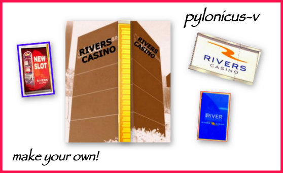
p.s. Have some fun with the kids or grandpa, and make your own Pylonicus-V design:
.
 Follow-up (Feb. 11, 2017): Speaking of bait-n-switch, see our posting “where did this unattractive Schenectady casino design come from?” (Feb. 9, 2017).
