
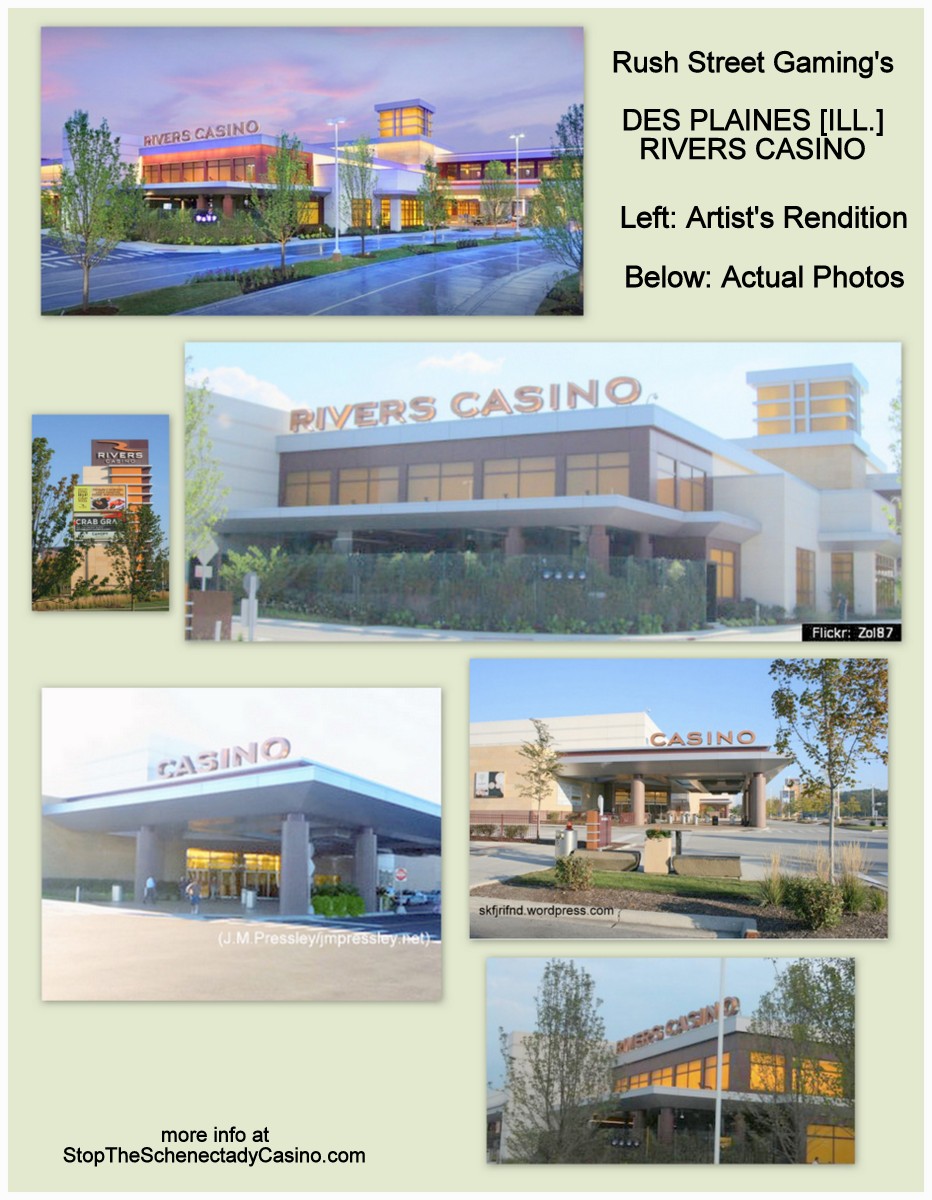
Des Plaines Casino Collage
The release of the new design for Schenectady’s Rivers Casino at Mohawk Harbor (see our June 6th posting) has started a robust debate that we hope will stir the City’s Planning Commission to actively evaluate and appropriately modify the casino Site Plan, which they will first treat in public on June 17, 2015. Press coverage has included: Schenectady Gazette (subscription needed): “Reaction mixed on new casino design” (by Haley Viccaro, June 6, 2015); “Rethink the new casino design” (Editorial, June 7, 2015); “History shouldn’t repeat itself at casino” (column by Sara Foss, June 7, 2015); and Letters to the Editor: “Casino design could use historic charm” by Virginia Newton, and “New design of casino screams out ‘cheap’” by Suzanne Miller (June 10, 2015, scroll to 3rd Letter). And, Albany Times Union (subscription needed): “Redesign of Schenectady casino is a dud” (column by Chris Churchill, June 9, 2015).
TU‘s Chris Churchill rightly points out that:
[T]he city should demand better. The casino is a once-in-a-lifetime project and opportunity.
It’s too important to get wrong. It should be a knockout.

photos taken by visitor at DPCR
Churchill also noted that the Planning Commission “would probably approve the casino if it looked like a giant Taco Bell.” Indeed, so far (e.g., with the C-3 zoning amendments), the Commissioners and Planning-Development Staff have acted like sleepy, toothless watchdogs, deaf to the requests and opinions of anyone other than the Casino Applicant (operator Rush Street Gaming, and The Galesi Group, site owner and developer), our Mayor Gary McCarthy, and County Planning satrap Ray Gillen. We hope the photos and images in this posting from Rush Street Gaming’s Rivers Casino at Des Plaines (Illinois) [“DPRC”] will prove more persuasive than the previous arguments and suggestions of many well-intentioned Schenectady residents.
The Des Plaines casino images in the Slideshow below teach us at least three important lessons:
- As Rush Street has indicated over the past year, the first Schenectady Casino Design, from June 2014, is like a fraternal twin to the Des Plaines casino, with minor cosmetic changes and element slightly re-arranged. We got hand-me-downs from our Midwest sibling, not a Schenectady-specific design.*/
 . . .
. . . 
– renderings: [L] Des Plaines Rivers Casino and [R] Schenectady’s Rivers Casino –
- The “reality” of the Des Plaines casino’s exterior is significantly less sparkling, futuristic, or inspiring than its artist renderings. (That might be why DPRC’s Facebook page still has a 5-year-old rendering, rather than a recent photo, in its masthead.) The reality of the Des Plaines design might lessen the grief of many who, after seeing the Second Schenectady Design, are praising the First Schenectady Design for the first time and bemoan its demise. They should perhaps not urge the Planning Commission to revert to the First Design, but instead ask how the Second Design might be improved so that it is worthy to represent the best of Schenectady’s past accomplishments and future prospects.
 A proposed pylon can be far more imposing once built than suggested in artistic “daytime” renderings. The brightness of the digital display at night and the size and intensity of the lightbox built into the pylon structure must be taken into consideration. The shorter height of the Des Plaines pylon (68′ as compared to 80′ in Schenectady) and of its digital signage area (25′ tall approx. compared to 32′ in Schenectady), as well as its apparently narrower width, should give pause to Schenectady’s Planning Commission as it evaluates the proposed Schenectady design and its proximity to a vital and complicated intersection. It should ask whether the non-sign portion of the pylon “cabinet” will be lighted; and, demand a line-of-sight study of the proposed pylon edifice, in daylight and at night. For safety’s sake, it should also keep in mind the reasons behind the Philadelphia ban on digital signs within 200 feet of an intersection (§ 14-904 (1) (b) Digital Display), and the insistence of the NYS Department of Transportation that digital signs appear no brighter at night than during the day, and no brighter than permitted roadside billboards.
- The Gazette June 7th editorial noted that “Judging from the new renderings, [the electronic signs are] as big and clunky and awful as some had feared. Interesting how those were the only things missing from the original design.”
-
Rush Street’s primary justification for its giant Schenectady pylon was that it had to be tall enough to be visible despite the STS factory building on the site. The renderings show no connection between the pylon and the STS building, which is in fact 49′ high and not being raised up above the 100-year flood plain like the casino compound.
 Click to see our Pylon Collage.
follow-up (July 17, 2015): In deciding whether the Big Brother of the Des Plaines pylon should be located near Erie Boulevard, the planned traffic rotary, and narrow Front and Nott Streets, they should take note that the Des Plaines pylon has a lot more “breathing room” than the Schenectady pylon would have. Here’s a collage showing it is in a much different kind of location (click on it for a larger version):

This Slideshow shows a lot.
.
We’ll let readers decide if we have drawn the correct lessons from the Des Plaines Rivers Casino. As we did in the posting “tips for the Planning Commission,” we urge members of the public to let the Planning Commission know their feelings on the overall casino design, the pylon issues, the proximity of the big, bulky hotel to the riverbank, the need to secure public access to the riverbank, and all the other issues that must be part of a Site Plan Review.
update (June 19, 2015): See “Why does Schenectady get Rush Street’s scraps.”
 */ It is surprising that the Gazette editorial on June 7, and then the June 9 Churchill Column in the Times Union, concluded that the new Schenectady Design looks like the Des Plaines casino. Compare the renderings of the Second Schenectady Design in the collage at the beginning of this paragraph with the Des Plaines images in the above Slideshow.
