
 BZA follow-up (November 16, 2017): Click for a copy of David Giacalone’s Comments to BZA regarding the Special Meeting today to review another Mohawk Harbor variance application for a 30′ pylon. What happened this evening? BZA approved a pylon virtually identical to the one they rejected on October 4, 2017. See “BZA pylon flip-flop“. Short URL: http://tinyurl.com/BZAflip
(November 15, 2017): I learned today that on November 1st, 2017, Board of Zoning Appeals granted Mohawk Harbor variances that would permit it to install a pylon sign 22′ tall and 122 sq. ft., at the location involved in the discussion below. The Zoning Code permits a sign 7′ tall of 75 sq. ft. at that location. Had I known of the application, I would have strongly opposed it as presenting the same problems as the 30′ pylon rejected by BZA on October 6, 2017.
- Mohawk Harbor was apparently so shook up by the rejection on October 6, that Galesi sent Big Guns, to literally beg BZA to permit the pylon application. Dave Buicko, Galesi Group CEO and Ray Gillen, Chairman of Metroplex, came to press the Board members. I am told that Mr. Gillen said, “I have never asked you for a favor, but please, please, please grant this variance.”
 Moreover, I learned late yesterday afternoon (Nov. 14), thanks to TU reporter Paul Nelson, that BZA had announced a special Meeting to be held tomorrow, November 16, in which Mohawk Harbor has resubmitted its previously rejected application for a 30′ pylon of 265 sq ft. The only difference is that it has given up asking for a 1′ setback instead of the required 3′ setback from the right of way. Click here for the Resubmitted 30′ pylon application.
Original Posting
post BZA update (10 PM, Oct. 4, 2017): This evening, the Schenectady Board of Zoning Appeals granted a variance for a “monument’ sign at the entrance to Mohawk Harbor at Mohawk Harbor Way and Erie Boulevard, but denied the request for a variance to permit a 30’ tall pylon sign along Erie Blvd, that had a large LCD screen and 22 lighted “tenant signs”. [But see, “BZA pylon flip-flop“.]
. . variance denied . .
- MH representative Paul Fallati had asked BZA to allow a 265 square foot pylon sign, with a height of 30 feet, a message board 12 feet wide, and a 1 foot setback from the NYDOT right-of-way.
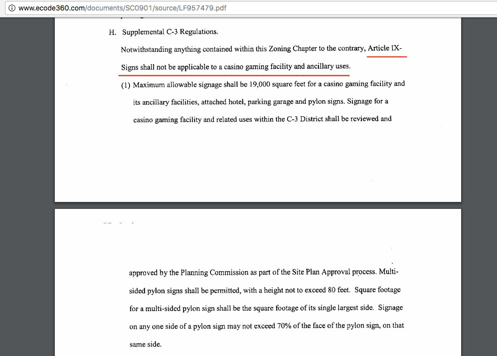
- A variance was needed because the sign schedule in the City Zoning code for the C-3 Waterfront Mixed-Use District only permits a 75 square foot sign, with a height of 7 feet, a message board 8 feet wide, and a setback of 3 feet. (Larger sizes are permitted for Casino-related signs but not for non-casino signs.)
- The Board found that the requested variances were significant, not justified, and could adversely impact close properties. BZA refused to merely accept the Planning Commission’s actions in support of a 30′ design. Click to see the odd and inadequate Variance Application for the Pylon Sign; also, the Variance Application for the Monument Sign, and a Site Plan illustration of the signage location and setbacks.
- A co-owner of Sev’s Luxury Used Car, located directly across the street from the proposed pylon on Erie Boulevard, pointed out to the Board the potential negative effects on nearby properties that desire to upgrade to more attractive uses, and asked if the large cement wall behind the proposed pylon was meant to protect Mohawk Harbor tenants from the glare of the bright pylon lights and screen.
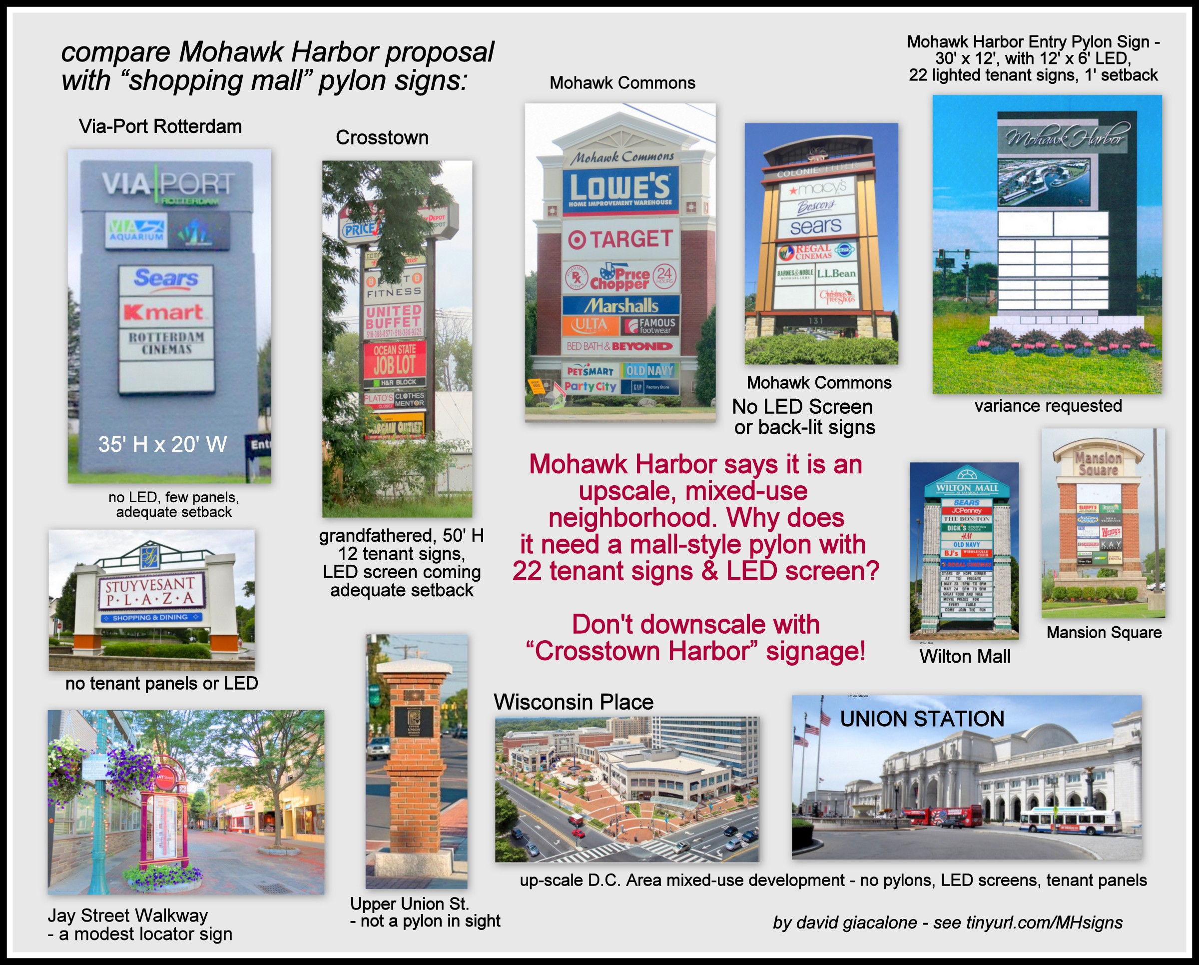
 David Giacalone, proprietor of this website, stated that BZA should have made its own independent review of variance issues before the Planning Commission spent two months helping MH design a 30-foot sign for a 7-foot sign location. He also stressed that (1) Mohawk Harbor is asking for a shopping-mall-style sign despite touting the development as an upscale mixed-use residential and commercial neighborhood; he presented a collage (seen below) to make the point; (2) a large, bright sign so close to a busy, complicated roadway presents many safety issues, including distracting drivers (intentionally) and creating major glare; and (3) the Applicant could not show that its difficulty under the zoning code is not “self-created”, because Mohawk Harbor was intimately involved with drafting the revamping of the C-3 District rules two years ago, and specifically left the original C-3 signage limitations for non-casino signs. These and additional issues are more fully discussed below.
- update (5 PM, Oct. 5, 2017): According to an article in the Daily Gazette posted this afternoon, “The board rejected the plan for the 30-foot sign by a vote of 4-2, said Avi Epstein, the city’s zoning officer.” In addition, “The proposal was denied because the board felt it would cause an undesirable change in the surrounding neighborhood, and that the applicant could achieve the purpose of the signage through another method, City Planner Christine Primiano said.”
 [Earlier] BZA Update (October 4, 2017): This follow-up relates to the requests by Paul Fallati, on behalf of Mohawk Harbor, for area variances to permit the two signs at the Mohawk Harbor Way entrance to the complex. The matter is before the Board of Zoning Appeals for the first time this evening, October 4, 2017. (Click to see the Variance Application for the Monument Sign, the Variance Application for the Pylon Sign, and a Site Plan illustration of the signage-intersection location and setbacks.) The issues are basically the same as discussed below regarding the appropriateness of the sign for the location, but the Board of Zoning Appeals should, I believe look closely at the statutory and code requirements for granting an area variance, and not let the Planning Commission preempt variance decisions, which places BZA in a rather awkward position.
The PYLON VARIANCE PROPOSAL: On behalf of Mohawk Harbor PAUL FALLATI requests Area Variances for 220 Harborside Drive located in the C-3 Waterfront District
- to allow for a 265 Square foot pylon sign, with a height of 30 feet, a total width of 18′, and a message board of 12 feet wide , with a 1 foot setback,
- where a 75 square foot sign with a height of
107 feet is allowed, and a minimum setback of 3 feet required. [Ed. Note: And, when the Schenectady Zoning Code defines a pylon sign as having a base no more than 5′ wide, with a message board no more than 8 feet wide. Code §264.]
The Application for the Pylon Sign in no way meets the criteria for granting a variance.
As in my August 2017 letter to the Planning Commission, a key issue is whether a giant pylon sign is appropriate, given the goals of the C-3 Waterfront District and the claims of the developer that this is a unique and upscale mixed-use residential-commercial neighborhood. As this updated collage suggests, the 30′ pylon, with its 22 lighted tenant signs and large LCD screen along a busy road is far more appropriate for a strip mall or shopping plaza. (click on the collage for a larger version)
This this update will be completed after this evening’s BZA meeting. Until then, please Click here for an 8-page set of Comments submitted on August 16, 2017, to the Planning Commission by David Giacalone regarding the Mohawk Harbor signs, which starts with the following summary:
 SUMMARY: First, the proposed signs are far larger than permitted for non-casino signs in the C-3 zone, and area variances must be obtained. On the merits, the placement of a large LED screen so close to a busy intersection and complicated roadway system is particularly worrisome from a safety perspective [from driver distraction and confusion, and glare], and the use of a shopping-center/strip-mall type pylon is contrary to the stated upscale aspirations of the developer and the goals of the City’s Waterfront zoning provisions. It cheapens the image of the Harbor Area, lessens the quality of life of residents in the vicinity, and reduces the attraction of adjacent property for higher use.
BELOW is a set of Updates to our post on August 4, 2017, “another sneaky pylon ploy“, on the proposed Mohawk Harbor pylon-style sign (14′ W by 32′ H, with an LED screen on top, 12′ W by 6′ H) and monument sign (40′ W by 10′ H), which are on the Schenectady Planning Commission agenda for August 16, 2017. In the Aug. 4th post, I argue that the signs are too large to be allowed in the C-3 district, because they are not casino-facility-related, and must comply with the normal regulations of Article IX of our Zoning Code. . .
share this post with this short URL: http://tinyurl.com/MHsigns
Commission Meeting Follow-up (Aug. 17, 2017): Important points, in addition to delaying making a decision until next month:
- As expected, the Commission declared itself the Lead Agency for purposes of SEQRA environmental review and adopted a negative impact statement. Interested Federal and State agencies, and the public may comment — e.g., statements about the impact of the signs on traffic safety, and nearby residents — over the next 30 days. In addition, the Commission correctly demanded detailed renderings showing the appearance, exact location, and orientation to the roadways, of the signs.
- Despite the statement to me by the Principal Planner earlier this week, Mohawk Harbor did not reduce the size of its proposed signs in deference to the need to seek a variance for each, which State law says must be the minimum increase required to meet the valid needs of the applicant. More worrisome, no Commission member spoke of the need for a variance, nor reminded Mohawk Harbor that only casino facility signs were exempted from the Zoning Code’s Article IX restrictions on the size of signs.
- Paul Fallati of the Galesi Group stated that one reason for such a large monument sign was to help screen out the sight of STS Steel.
- Commissioner Bradley Lewis correctly pointed out that the proposed large pylon does not actually have the name Mohawk Harbor prominently displayed, so as to alert drivers they are approaching the development.
-

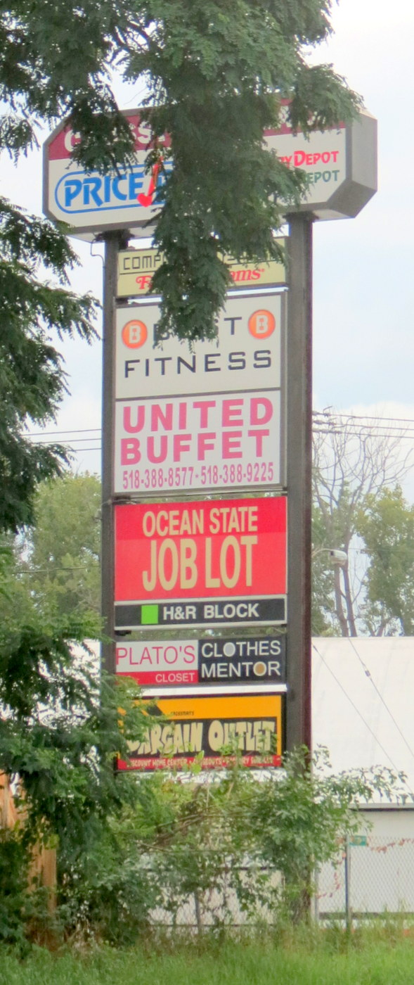
Crosstown Plaza pylon
David Giacalone [proprietor of this website] stated that variances were needed, and that a large pylon with signs for 22 tenants would make upscale Mohawk Harbor look like any old shopping mall. [image to the right is Crosstown Plaza’s sign; with $480 million to spend, I am pretty sure the Lupe family would have developed a very tasteful plaza at Crosstown.] Giacalone reminded the Commission that they need to consider the safety elements of having a large LED screen, plus the lighted tenant signs, just a few feet from a busy road.
- To my argument that the miSci sign on Nott Terrace is adequate as a branding sign at 12′ W by 10′ H (see discussion and images below), Mr. Fallati said the traffic is much faster on Erie Blvd. so drivers could not see 22 little signs on such a small structure. See “Decision on Mohawk Harbor signs put on hold” (Gazette, by Brett Samuels, Aug. 17, 2017). He apparently missed my argument that we do not need to have a cluster of tenant signs at all, and that 22 tenant signs would not be very informative no matter how large the pylon is — i.e., the Crosstown Plaza pylon is 14′ W and 50′ H (grandfathered in at that height) and passing traffic surely does not become well-informed about the tenants..
ORIGINAL POSTING:
Schenectady’s Principal Planner, Christine Primiano, gave me some helpful information this morning (Aug. 11, 2017), with a quick reply to a few questions about the Mohawk Harbor signs and process. She wrote that “The signage below the LED screen [on the proposed pylon] are panels with the business names and they will be lit. The LED screen will change message, advertising events and businesses within the MH complex.” Individual products or sales will not be advertised on the screen. In addition, Ms. Primiano wrote that “The [monument sign] is intended to name the complex and provide some visual screening of the STS Steel site, however, they are already talking about making it smaller because there are size and setback issues.” Christine also wrote that:
-
On 8/16 the Planning Commission will declare Lead Agency for the SEQR review which starts a 30 day window for interested parties (i.e., Mohawk Towpath Scenic Byway) and involved agencies (NYSDOT and Sch’dy BZA) to comment on the proposal.
-
The Planning Commission will not take any other action on 8/16 other than to give their feedback on the design.
- It’s anticipated that on 9/20 the Planning Commission will take action to either issue denial or conditional approval of the proposal. If they issue approval, it must be conditioned upon approvals by NYSDOT and Sch’dy BZA.
- 10/4 Board of Zoning Appeals to review the area variances needed to allow the signs.
 . .
. . 
. . above: proposed locations on either side of Mohawk Harbor Way at Erie Boulevard for the proposed monument sign [L] and pylon sign with LED screen atop. Click on each image for a larger version. Click here (for the Monument Sign) and here (for the pylon sign) to see the two Special Use Permit applications.
 . . .
. . .  For additional details, please see our Pylon Ploy posting about the two MH signage applications, including the submitted sketch images of the Pylon and Monument signs, and legal discussion of the need for variances due to the excessive height and square footage. The Planning Commission staff appears to agree that variances will be needed unless there are significant reductions, and is therefore contemplating referring the final proposals (relating to allowable dimensions) to the Board of Zoning Appeals for variance review, with possible action by BZA in October.
ISSUES AND ANALYSIS
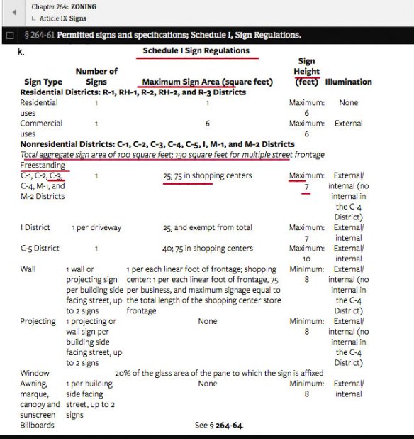
Here is the Schedule I list of signage regulations in the various districts. Mohawk Harbor is, of course, in the C-3 Waterfront Mixed Use district, and Schedule I and all Article IX provision on Signs apply to the applications before the Commission, because they are not covered by the 2015 Amendments, which exemption granted to casino-facility-related signage.
.
SIZE & STYLE: Given the City of Schenectady’s goals for its mixed-used waterfront district, how much leeway should Mohawk Harbor’s owners have when it comes to the size and design of its freestanding roadside signs?
Here’s how Mohawk Harbor describes itself on the homepage of its website:
Mohawk Harbor is a 60 acre master planned community that integrates luxury living, high-tech offices, restaurants and retail along one mile of the Mohawk River. When complete, Mohawk Harbor will consist of over 1 million sf including 206 apartments, 50 condominiums, 15 townhouses, 2 hotels, 100,000 square feet of harborside retail/dining, 74,025 SF of Class A Office space, and one of New York State’s 1st licensed casinos, Rivers Casino & Resort.
And, River House, the residential element of the project, is said to offer, “a new style of living in the Capital Region with its a one-of-a-kind, resort-style residences. ” And,
Situated along the new “Mohawk Harbor”, the Riverhouse provides a unique urban lifestyle that is one-of-a-kind in Upstate New York. Featuring 206 waterfront apartments that overlook the Harbor, it provides the perfect balance of serenity and vitality with its scenic river and mountain views in combination with the vibrant energy of downtown Schenectady
THE PYLON STRUCTURE and SIGNAGE
 . . . close to River House and future homes
 Given its stated aspirations and pretensions, it is difficult to understand why Maxon Alco Holdings LLC would want to put what is basically a “shopping center” pylon on Erie Boulevard as its branding sign, with twenty-two internally lighted tenant signs shown in the sketch submitted to the Planning Commission. The following collage (click on it for a larger version) asks: If Mohawk Harbor is an upscale, mixed-use “neighborhood”, why does it need a mall-style pylon with tenant signs and large LED screens?

Of course, such things are a matter of taste, but in my experience, it seems that the most “tasteful” shopping plazas and galleries, and mixed-use developments (such as Wisconsin Place, in Chevy Chase, MD, a couple blocks from District of Columbia’s northwest border) do not place tall tenant signs, much less huge LED screens, along their entrances. A kiosk inside the complex is far more palatable.
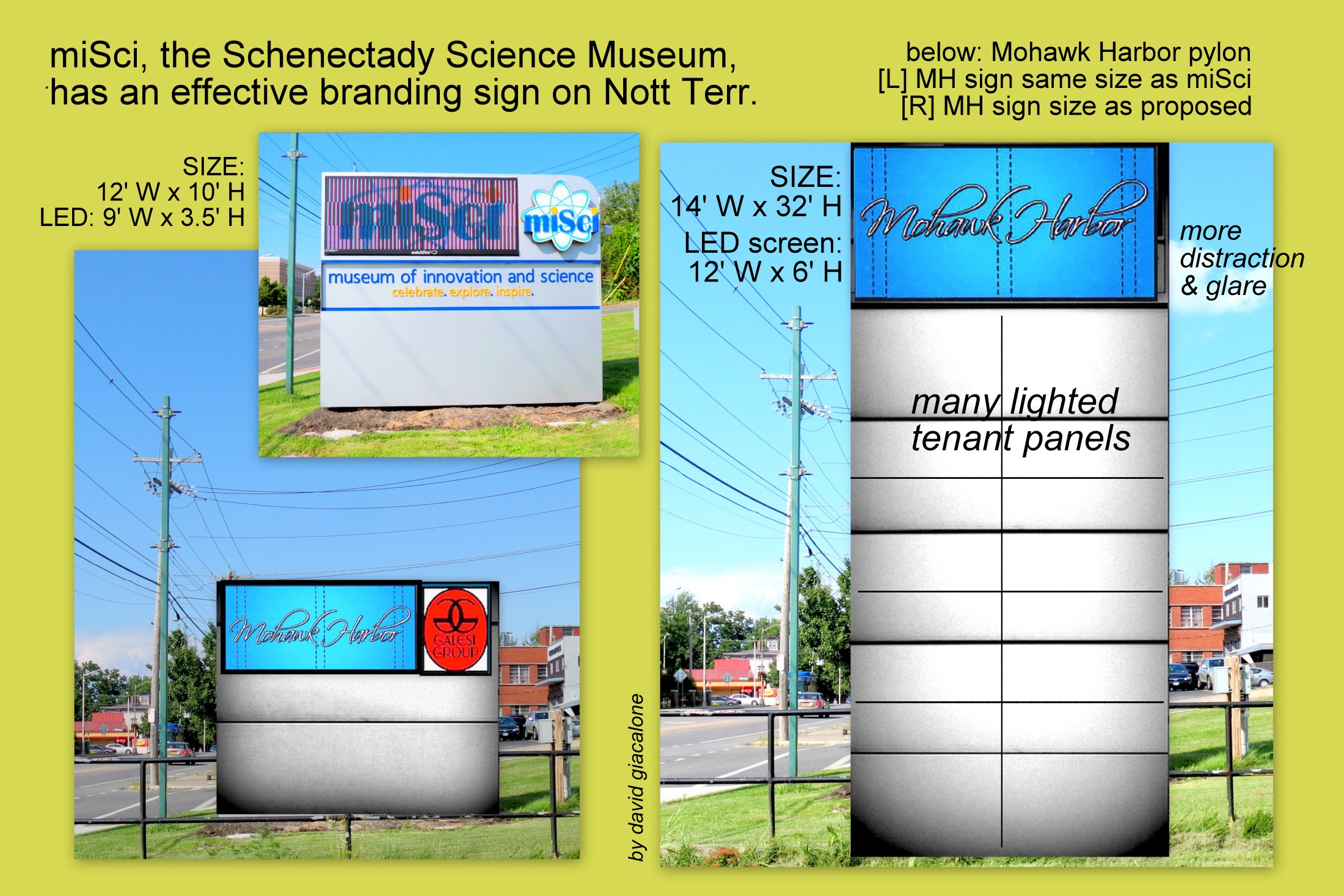
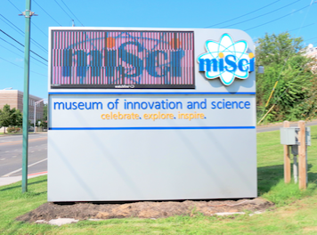 How large does an effective Branding Sign have to be, especially for a destination-establishment that constantly receives boatloads of free media exposure, for the entire complex and for each new “tenant” business? MiSci, the Schenectady Museum of Innovation and Science, gets far less publicity, but its branding pylon sign on Nott Terrace seems to do the job well, at 12′ W and 10′ H, with an LED screen about 9′ W and 3.5′ tall. See the image at the right. The following collage shows what a Mohawk Harbor sign of the same size might look like at miSci’s Nott Terrace location, and what it would be like at the 32′ by 14′ dimensions requested the the Applicant, including a 12′ by 6′ LED screen. [click on the collage for a larger version]
Similar questions need to be asked about the appropriate size of the monument sign at the entryway to Mohawk Harbor. Just a block to the east, on Nott Street, the Golub Corporation has its headquarters, for its Price Chopper and Market 32 chains of supermarkets, in a building developed and owned by the Galesi Group. As you the see in the next collage, it does rather well making itself known to passersby with a freestanding branding sign no larger than 8′ H by 18′ W.
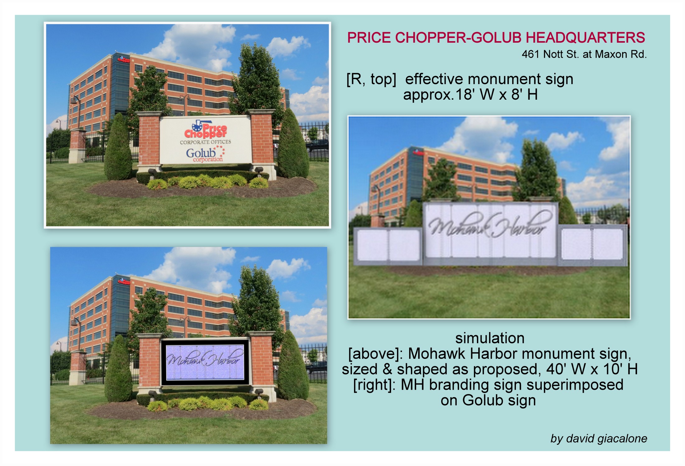
The desire of Mssrs. Galesi and Buicko to block the view of STS Steel is silly and inappropriate, and the Planning Commission and Board of Zoning Appeals should say so, especially given the brazenly excessive application for a monument sign that would be 40′ W and 10′ tall. For many of us, the STS Steel factory and complex is at least as attractive as most of Mohawk Harbor (especially its boringly ugly Rivers Casino neighbor), and symbolizes much of what was best in Schenectady’s history and desired for its future. The Planning Commission cannot simply trust the taste and good intentions of the Applicant. It must do its job, along with BZA, to assure that the size and design of Mohawk Harbor is consistent with the goals of the C-3 district, and the best interests of our entire community. That includes people who will soon be living at Mohawk Harbor or across the Boulevard in new homes, and those investors the City hopes to entice to take a chance on new businesses across from Mohawk Harbor.
One final thought: We are well past the time when the Galesi Group or Rush Street Gaming can be allowed to rush applications past our City officials and boards with exaggerated deadline claims. The Planning Commission, and then the Board of Zoning Appeals, must demand detailed descriptions and renderings of the proposed signs, especially the pylon that will be tall, very close to Erie Boulevard, and topped by a frequently-changing, high-intensity, LED screen. Crucially needed is a precise description and depiction of the location of the pylon and its orientation to the road and to residences in Mohawk Harbor. [Please see our discussion of safety issues relating to the use of electronic message displays along urban roadways at tinyurl.com/electronicdisplayfactors.]


 Right after giving the Planning Commission the easily-refuted excuse (see our posting “


