

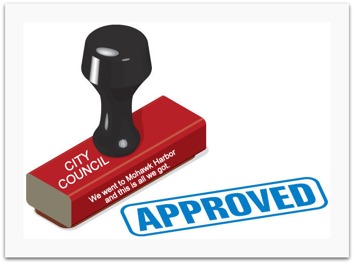
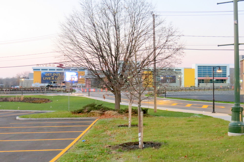
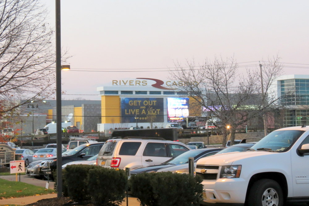
Despite weeks of fawning coverage and cheerleading by local broadcast, internet, and print media, I have yet to hear or read any praise for the exterior design of Rivers Casino at Mohawk Harbor in Schenectady. Nor any questions on why it looks so different from the design we thought we were getting in July 2015. And, unless you count this website, no one in the media has attempted as of yet to put a name to the “style” of the façade presented by Rivers Casino to the world, which is very likely to become the new image of Schenectady, and which for my money doesn’t meet the aesthetic standards of a Sonic Drive-in.
. . share this post with this short URL: http://tinyurl.com/homelycasino
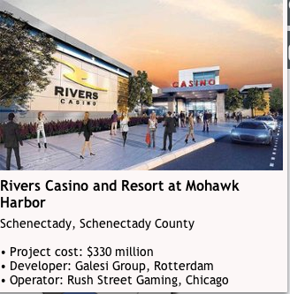
How did we get this sad result? Casino owner and developer Rush Street Gaming presented three renditions showing a front view of its proposed casino from a perspective similar to the actual casino shown above:
 . . 1st version
 . . 2nd version
 . . 3rd version
The public and media made it clear when the second version was unveiled in early June 2015 that they cared very much about the design of the Schenectady casino and disliked the retro-brick-factory look of the 2nd design. Despite this interest, Rush Street’s next attempt, released on July 9, 2015, presented only two details of a modern design meant to point to Schenectady’s future — the above partial view of the front entryway and a view of the rear. The disappointed reaction of the Gazette‘s editorial staff was titled “Casino design is better, but public needs to see more” (Sunday Gazette, p. D2, July 12, 2015; no longer online). The editorial began, “You have to give them credit. It’s better than the last version. But is it enough?” The conclusion was a loud “no”:
The drawings released Thursday show little of the building other than the entrance and one shot from the river. They also don’t show the perspective of the pylon sign in comparison to the new structure.
It might seem nit-picky to want to see more. But as we’ve said before, we’re all going to have to live with this thing for a few decades, and we want to make sure it’s going to look like what they say it’s going to look like.
If the public is going to offer intelligent comments to the Planning Commission, they need to see more of the new design so they have a more complete perspective. In the 10 days leading up to next Wednesday’s Planning Commission meeting, we urge casino developers to post more renderings of the new redesign online and share them with the community. . . .
The more information the people have about the project, the more transparency government affords them, the more likely it is that they will accept it.
That should be the goal of the developers, and most importantly, the city’s government.
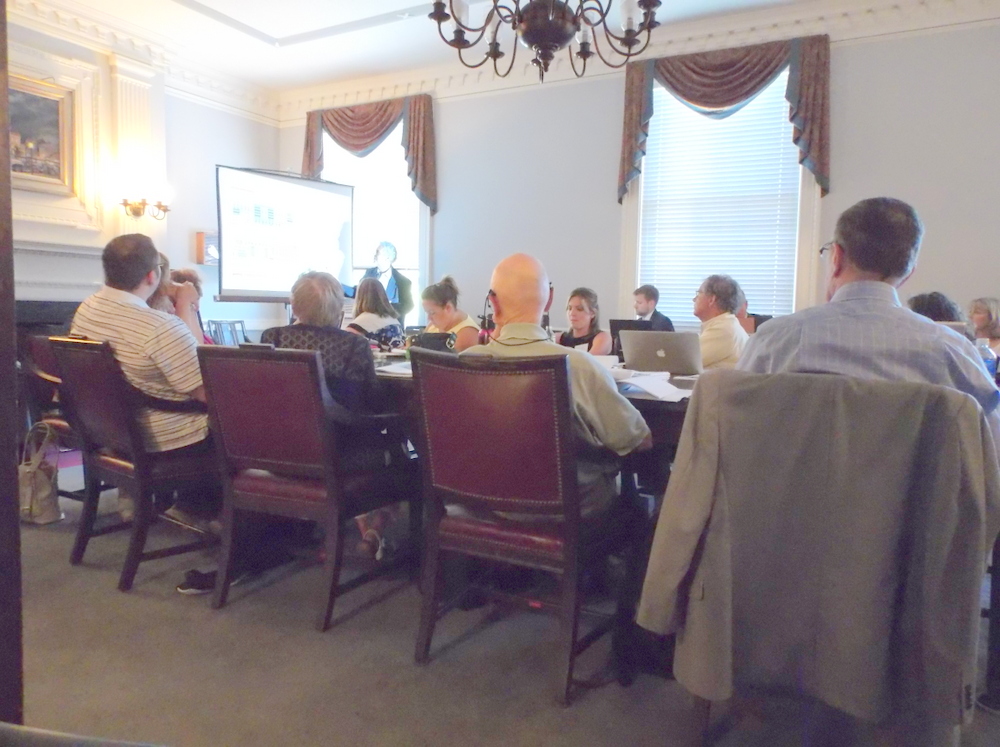
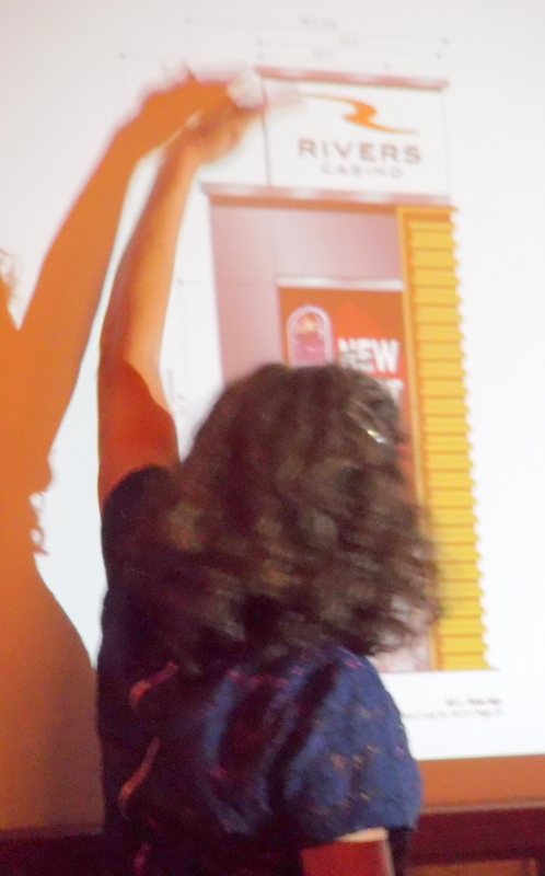
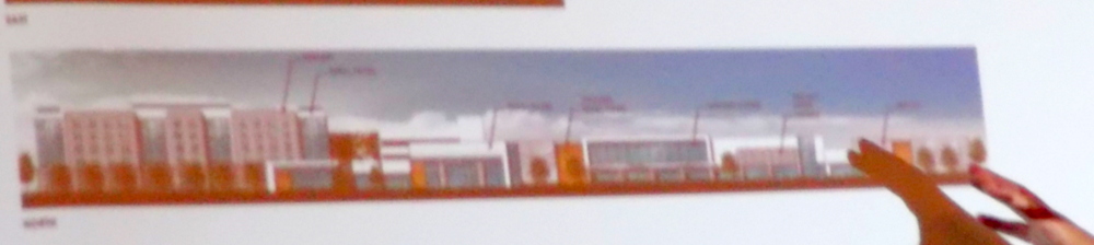
Despite that sensible plea, Rush Street offered no further rendering for the public or the Planning Commission, and the Commission irresponsibly failed to demand more. The next view of the proposed 3rd design was merely a small group of Power Point sketches projected on a screen at the special Site Plan Meeting of the Commission, on July 22, 2015. I photographed the colorized sketch below of the 300-foot-long front of the Casino structure from the back of the room with a small camera (thus the lack of focus):

The public never got to see more prior to or after the Special Site Plan Meeting. A visit to the Planning Office on July 24, 2015 revealed there were no hardcopies of the Power Point presentation submitted for the Commissioners to review prior to or at the Meeting, nor for the public to see. (See our posting, “casino site plan approved” (July 23, 2015)
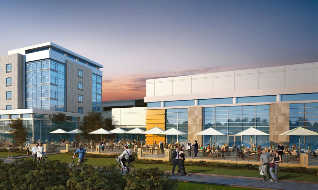
This screen shot and text from the Gazette article “Schenectady casino design gets green light” on July 22, 2015, shows what they and we had believed would be the final design:
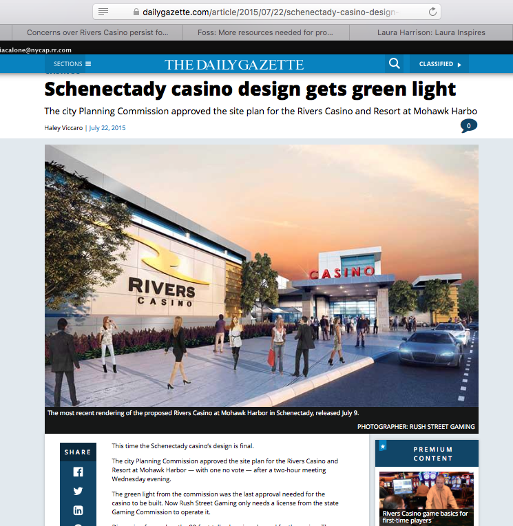 “The façade of the casino has shifted from an industrial look with brown bricks to a more contemporary look with white-gray coloring and metal panels.
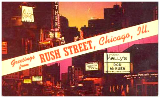
“Chicago casino operator Rush Street Gaming went back to the drawing board after being hit with negative comments from the public about the initial [second] design plan. Several of the commissioners said they like the new design better than previous renderings released to the public. Klai Juba Wald Architects of Las Vegas designed the casino.”
As the Gazette opinion editor stated on July 12, 2015, “we want to make sure it’s going to look like what they say it’s going to look like”. Well, obviously, thanks to the back-bending Snowmen on the Planning Commission, we got something else. The City’s chief planner, Christine Primiano, wrote an email three days ago, assuring me that “yes all changes to the July 2015 design were approved during the April 13th, 2016 review. It was for amended site plan review and final sign approval.”
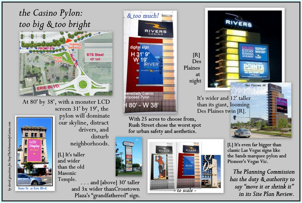
 The approval was, indeed, done in the guise of the Commission approving the final signage plan for the Casino, which was primarily publicized for no longer including an 80′ pylon structure and reducing the overall signage on the casino and its hotel. There was no mention of the drastically altered entryway wall, which jettisons the 3rd design’s “more contemporary look with white-gray coloring and metal panels.” In actuality, the large LCD screens that were going to be placed on the pylon sign, were basically affixed to the entry façade of the Schenectady casino. And, no, there were no renderings of the Casino’s new look.
 Thus, in April 2016, the only image the Commissioners were shown of the portion of the Casino’s front entryway that had been presented as its 3rd design and approved in July 2015 was the sketch shown to the right of this paragraph. It comprised about a quarter of page six of a 7-page document titled Signage and Wayfaring Program. [Click here to see the entire page.] And, neither the Planning Commission staff nor the Chair of the Commission demanded a fuller depiction, which they clearly had the authority to do prior to putting the matter on the Commission’s agenda. Because the Planning Commission does not post submitted documents along with its online Agenda notice to the public, and Rush Street did not share its submission with the public or media, others would have seen that minimalist sketch only if they made a trip to the Planning Office and asked to view the file, or if they somehow knew they could request that the document be emailed to them.
 As so often has happened while witnessing the multi-stage, multi-year process of Casino approval at Schenectady’s City Hall, I’m left wondering if I’m watching Fools or Knaves (or both) going through the motions of enforcing the City’s laws. For sure, they seem like Snowmen, blind, mute, toothless, disarmed, and heat-averse. Who can say if the Planning Office and Commission were fooled by this bait-and-switch? I would hate to think our officials are so incompetent or naive. The public and media certainly cannot be faulted for their ignorance of the nature of the pig inside the casino’s design poke. Indeed, even today (February 9, 2017), with the Rivers Casino already open, The Galesi Group’s Mohawk Harbor website continues to show the July 2015 3rd design entryway as the first slide on its “Play-Here” page touting the Rivers Casino portion of Mohawk Harbor. Here’s a screenshot taken this morning:

- Likewise, Galesi Group used the 3rd design in the ad it took out welcoming Rivers Casino, in the Gazette’s January 31, 2017 advertising supplement, The Road to Rivers. click to view.
The words of the Gazette editorial of June 7, 2015, written in response to the retro-factory style 2nd design, are still highly relevant when thinking about the undesigned, styleless reality of our real-life Rivers Casino:
Rethink the new Rivers casino design
. . . Maybe we’re supposed to be grateful for any design at all. Certainly, anything they build will look better than the existing giant empty lot, for decades littered with piles of construction debris, steel girders and weed-covered clumps of dirt.
But we weren’t promised just anything. We were promised a spectacle. And this design is a fizzled firework. . . .
Perception equals reality. What is the perception we want people to have of our new casino and retail center and hotel and townhouse complex? And how will that perception ultimately affect the bottom line? How enthusiastic are people going to be driving great distances to a facility that looks like a relic from the WPA? What reality will we get in return for this abrupt change in design concept?
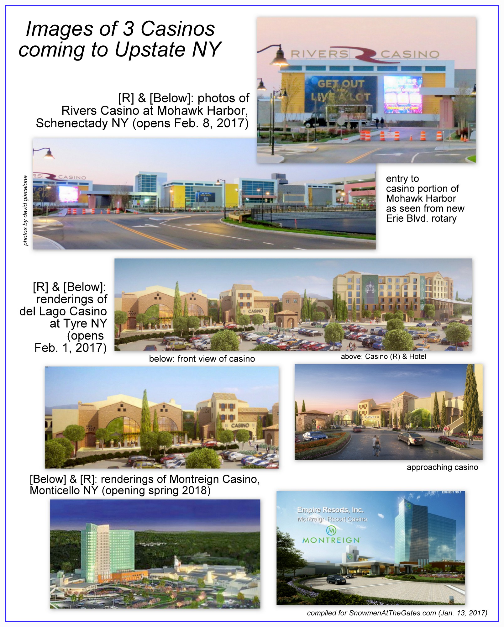
As we emphasized in our posting,“why does Schenectady get Rush Street’s scraps?” (June 19, 2015), Rush Street Gaming clearly knows how to produce an attractive, even spectacular, design. We got much less, it seems, because our Mayor and zoning/planners officials failed to demand a quality design. How will our homely casino exterior affect its bottom line, and thus the tax revenues generated by it? We will have to wait and see. Our posting last month, “casino choices in upstate New York: who will choose Schenectady?” is not optimistic that we can successfully attract people from outside a very small geographic area, given the many other casinos that actually try to look like a tourist destination.
How did we get stuck with this unattractive casino in Schenectady? The reader can decide for herself or himself how or why it happened. We believe City officials more interested in pleasing or appeasing the developer and casino owner, and their button-man, Mayor McCarthy, failed to do their jobs, and have diminished themselves and our City.
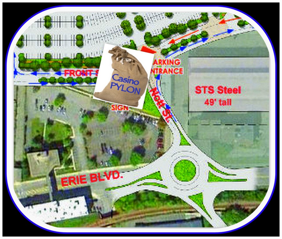
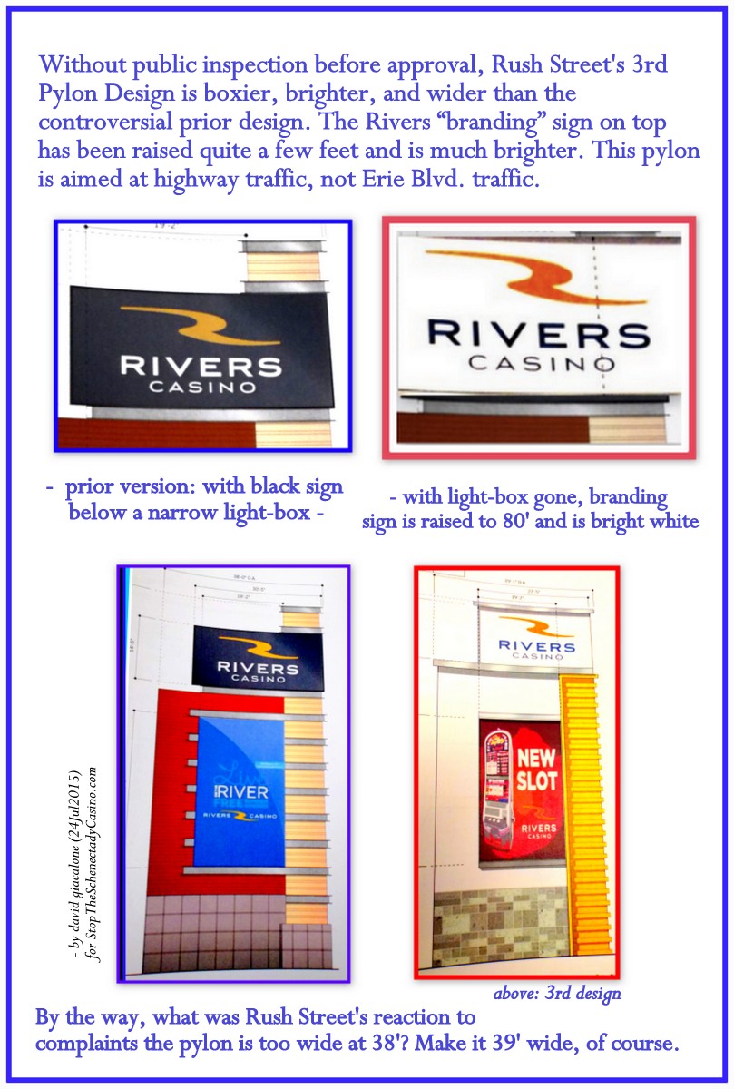
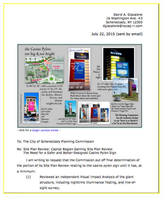
- For more Rush Street bait-n-switch, click here, concerning the giant pylon sign.
 In addition, see “Casino sign plan to be submitted to the city in ’16” (Albany Times Union, December 13, 2015), where TU reporter Paul Nelson states that sometime next year Rush Street will submit “a more comprehensive look at the design of the 80-foot pylon or gateway sign that will welcome visitors” to the casino, “as part of a larger package dealing with all the signage on the 60-acre Erie Boulevard site.” Nelson notes that:

“Mike Levin, a consultant with Rush Street Gaming, said last week that design plans will focus on colors and lettering of the pylon sign that some critics have complained is too garish.”
Their response to worries about the pylon colors and garishness was, it now seems, to move those elements to the façade of the casino building itself. Just another thumb in the eye of the Planning Commission, City of Schenectady, and its residents.
– afterthought (February 10, 2017) – 
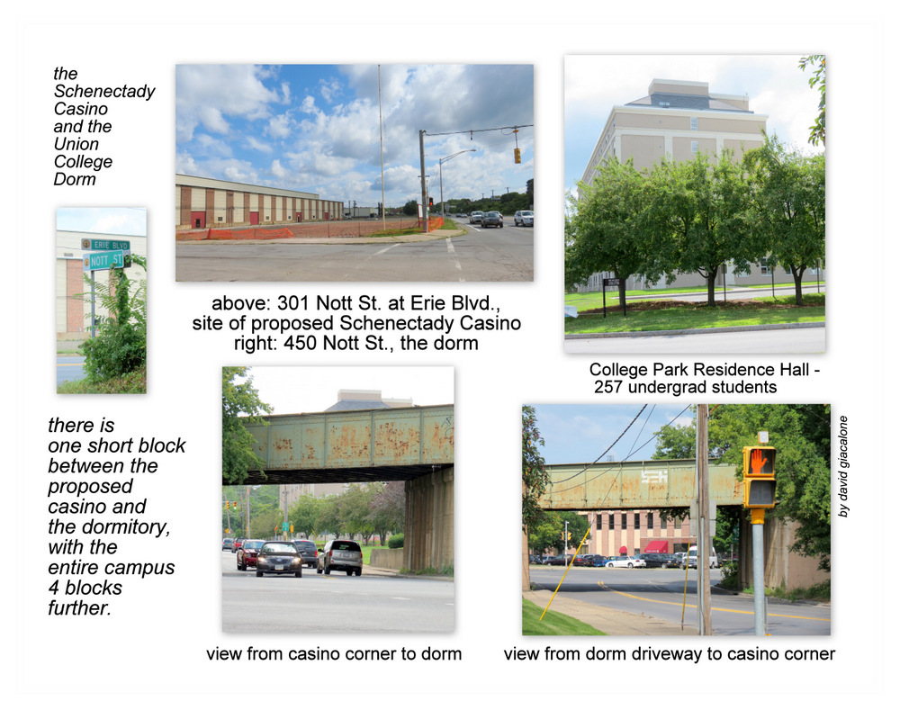
The collage below shows the three blocks of Erie Boulevard leading to the Schenectady Casino coming from the north (I-890, or State Street/Rte.5). Click on it for a larger version:
 . . The much-touted Renaissance of Downtown Schenectady has not exactly reached Erie Blvd. near the Casino. .


 Another reason for the humdrum design was suggested to me by an outgoing City Council member, and raised by others: If the Schenectady Casino fails, the owner of the land, The Galesi Group, wants the buildings left on the site to be easily converted into almost any new use — from big box store to light industrial use, to small shops or offices, etc. The last thing Mr. Galesi wants on his land if the Rivers Casino fails is a building that “looks like a casino”. Under this scenario, Rivers Casino is so iffy a project, that we got a casino compound that could be walked away from without too much of a mess for its landlord — a second-rate design in case Plan B is needed in the not too distant future.

 Our website name “Snowmen at the Gates” refers to the legendary snowmen “standing guard” in a blizzard, on February 8, 1690, outside the open north gate of the sturdy stockade fence that was built to protect the little village of Schenectady. Although messages had been received from the larger outpost at Albany warning that a war party was on the way that evening, the appointed sentries apparently decided to leave their posts to have a tankard or two at the nearby Douwe Aukes tavern. That dereliction of duty allowed a band of 114 French soldiers and 96 Sault and Algonquin Indians to enter the stockade, burn down the village, and massacre, kidnap, or scare away its residents.
 We who watched every element of our cheerleading City and County government [along with the Gazette] cave in to every demand of the Casino Gang (with only Mr. Riggi and Ms. Porterfield in opposition on the City Council), and ignore all warnings and research concerning the likely negative effects of a casino and ways to mitigate them, do not believe the lessons have been learned from the 1690 Massacre. Our Mayor, Metroplex Chair, and County Legislature prefer to have harmless, voiceless and blind Snowmen sitting on our boards and councils, turning over the keys of the City and the decision-making machinery to the Casino Gang.


 For the story of the Rigging of the News by the Gazette during the casino application process, see


 The proposed streets are Rush Street, which is an extension of Nott Street off the roundabout entering the site. Off of Rush Street to the right is the proposed Harborside Drive, which runs parallel to Erie Boulevard. Off Harborside Drive to the right is the proposed Mohawk Harbor Way, which is an extension of Maxon Road.
 Below, I offer several reasons why “Rush Street” is an inappropriate name at Schenectady’s Casino Compound. First, though, I acknowledge that there are many other suitable names for the roadways in Mohawk Harbor. My personal preference is that this piece of our City and its history, which for generations was the location of the American Locomotive Company’s headquarters and primary manufacturing operations, and which for the past few decades has been called the Old ALCO site, be commemorated for its role in Schenectady’s proud history of Hauling the World and strenuously contributing to our nation’s war efforts. That can and should be done by paying tribute to ALCO and its workforce in the street name of the roadway used to enter the casino compound at Mohawk Harbor, and perhaps the two other streets. [Click here for a


 follow-up (Aug. 4, 2017): Galesi Group and Mohawk Harbor have opened a new chapter in their Pylon Tales. See “

 Mohawk Harbor’s Rush Street Gaming has demonstrated the enforcement difficulty rather frequently in its Philadelphia casino, SugarHouse. For example, see “


 Roger Hull, former Union College President and Schenectady mayoral candidate, had a Letter to the Editor in Wednesday’s Daily Gazette questioning the ability of the Gazette to be an objective critic of our local government. See “


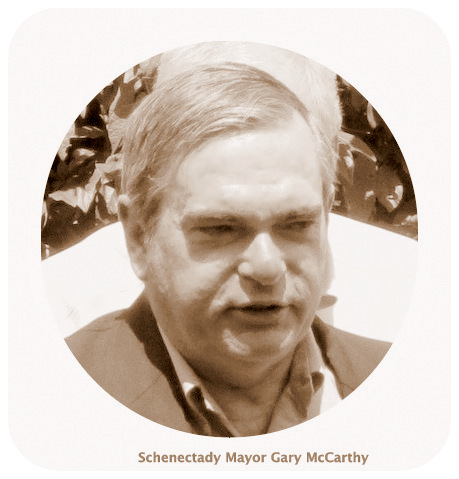
 Even worse, the Mayor confirmed for us that the Casino Pylon Monster has the purpose of “branding” Schenectady as a Casino City, by saying the GE sign did a good job of branding our City. I am proud of Schenectady’s relationship to GE, but having the Rivers Casino sign as the symbol of our City — which is clearly the goal of Rush Street Gaming — will be a source of embarrassment for myself and the majority of people of our City and County.
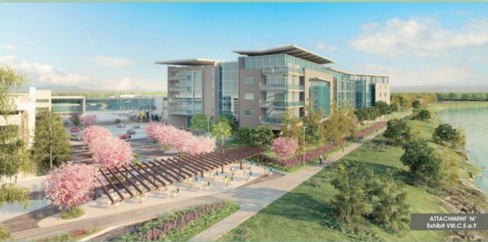


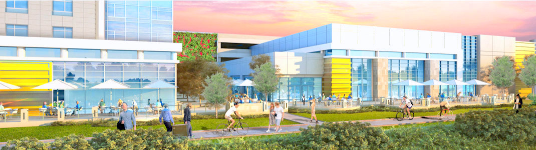
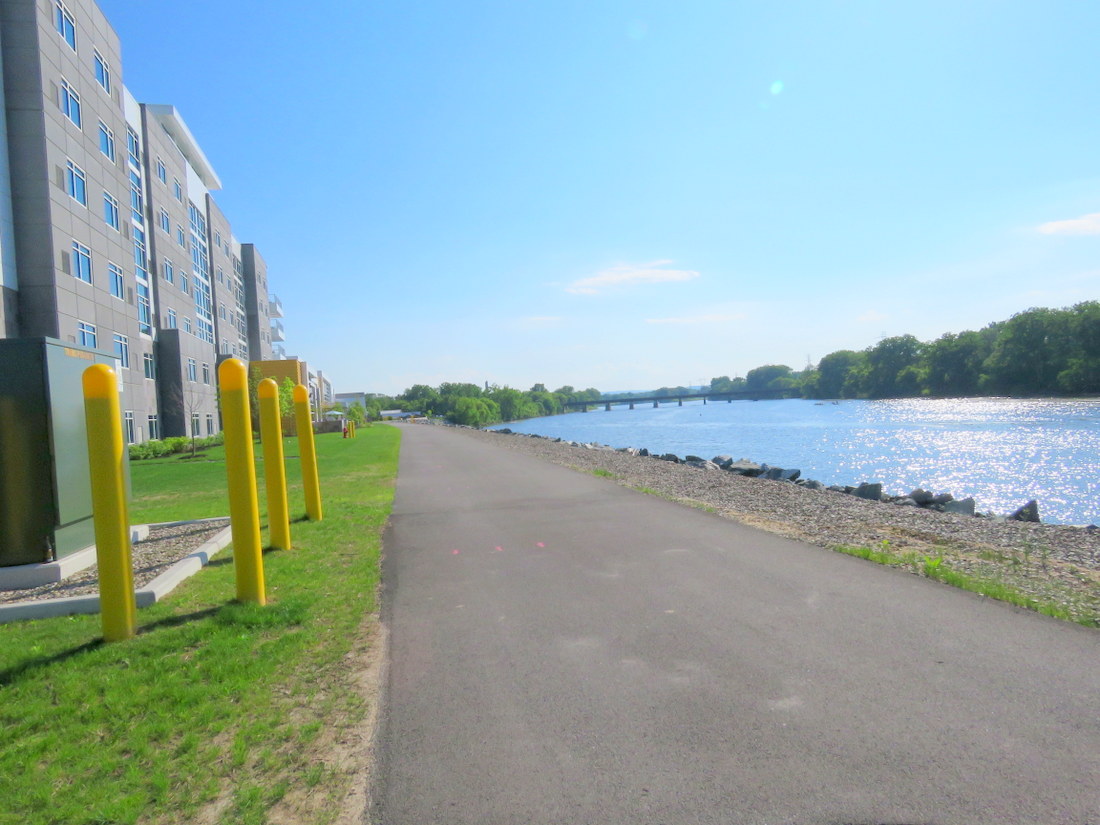
 There appear to be no spots for anyone other than casino patio customers to sit down, and no space for picnicking or similar waterfront activities. Whether you are a senior citizen, a tired runner, a family with children, or a couple on a date, “keep moving” and “stay on the path” will apparently be the message from Rivers Casino at Mohawk Harbor, compliments of Mayor McCarthy.

 update (December 18, 2015): According to an article in the Albany Times Union by Paul Nelson, “


